Stac_ipyleaflet: Easier Interactive Maps Have Arrived

The Multi-Mission Algorithm and Analysis Platform (MAAP) team unveiled stac_ipyleaflet, the latest addition to MAAP user tool boxes.
author-share

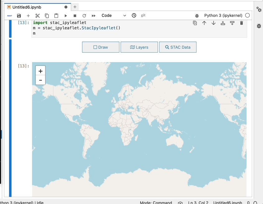
On May 25, 2023, the Multi-Mission Algorithm and Analysis Platform (MAAP) team unveiled stac_ipyleaflet, the latest addition to MAAP user tool boxes. Built on top of ipyleaflet, this open-source tool allows users to make interactive maps in a Jupyter notebook, mixing data published in the MAAP Spatial Temporal Asset Catalogs (STAC), with users’ local data.

MAAP provides an online collaborative code development environment in a web browser, enabling users to easily access, share, and process aboveground biomass data and code (learn more on the MAAP Dashboard). While the MAAP includes a visualization dashboard for intuitive data exploration in a browser, stac_ipyleaflet allows MAAP users to programmatically visualize any data cataloged in STAC, along with their own data, in an interactive map. Users can pan, zoom, and– in the future– add color customization, inquiry, and custom STAC query capabilities. This functionality makes it significantly easier to visualize data from cloud storage and create mosaics of large amounts of data.

The stac_ipyleaflet tool introduces the ability to search and add data, such as biomass layers, from a STAC catalog. These are offered as Cloud-Optimized GeoTIFFs. The user then adds data layers onto an interactive map inside a code notebook analysis environment (Jupyter). The tool also uses Jupyter Widgets (aka ipywidgets), allowing for user-generated code to modify the map and use the map to help write code for other users.

Image
Loading the stac_ipyleaflet library and using the ‘draw’ widget to get coordinates on the map based on an area of interest

Prior to this addition, MAAP users needed to write all the code to search, access, and visualize large data outputs in an interactive way that allowed them to do scientific research. This is a challenge for researchers looking to compare large quantities of high resolution data from different datasets. Stac_ipyleaflet requires less code, making it easier than ever to combine data from STAC with data from the user’s notebooks in an interactive map.

Image
The layers widget includes some starter/default data layers that you can instantly view on the map and make adjustments to the opacity and basemap. The STAC data widget is showing how you can add more custom data and see it displayed on the map.

Users are already excited about the possibilities stac_ipyleaflet enables. Nathan Thomas, a MAAP user working group member, says that “stac_ipyleaflet is the feature we’ve been waiting for since day one of using MAAP three years ago.” Other user working group members are equally enthusiastic about the added capabilities. One anonymous user is “excited that there’s this easily accessible tool in the notebook to quickly look at existing data products. That’s something we wanted for a while, something to replace QGIS to some extent.”

This is only the first beta release of stac_ipyleaflet. In collaboration with MAAP users, the team has planned out a roadmap of features and are already hard at work making improvements for another release soon. Over the next few months, the team aims to increase data functions and control. They will do this by consolidating the interface of layer and STAC widgets and adding new capabilities. New capabilities include allowing users to inspect a cell or feature information; the ability to filter STAC data for cloud-optimized formats; pre-configuring map settings including access to custom STAC catalogs; the ability to visualize multiple STAC layers on a map as a mosaic; and widgets for selecting local data in the workspace.

Image
Graphic showing the workflow from input dataset to output dataset
The workflow from input dataset through exploration and visualization, ultimately to new output dataset. This in turn can become an input for another analysis. The shaded components — explore and visualize and mosaic — indicate where stac_ipyleaflet enables Multi-Mission Algorithm and Analysis Platform (MAAP) users to more efficiently execute this notebook development lifecycle.

At the same time, NASA’s Visualization, Exploration, and Data Analysis (VEDA) platform team is actively importing this feature into their own Jupyter environment for scientists to use. VEDA serves as a scalable and interactive visualization, exploration, analysis, and processing system for science data (learn more about VEDA here). Integration of stac_ipyleaflet for both platforms is the first step in building a community around the tool that will lead to greater science team involvement and feedback for improvement. Further, stac_ipyleaflet will be usable in any notebook environment to more easily integrate cloud-optimized data with other data read into a user notebook for intuitive, interactive map exploration. The beta release of stac_ipyleaflet marks a significant milestone in constructing a visualization tool developed and maintained by the MAAP community. Because stac_ipyleaflet is inspired by open science principles, it will enable easier scientific analysis for all potential users.

Learn more about stac_ipyleaflet and how you can use it.

More information about IMPACT can be found on the NASA Earthdata and IMPACT project websites.

Last Updated