Background

The all-weather ability of synthetic aperture radar (SAR) to penetrate cloud cover and low-light conditions to acquire imagery of the Earth’s surface is well known. Given the recent availability of high-resolution terrain models at 30 meters from the Shuttle Radar Topography Mission (SRTM) and an interest to make SAR data easier to use, the Alaska Satellite Facility (ASF) now offers radiometric terrain corrected (RTC) L-band image products from Advanced Land Observing Satellite (ALOS) Phased Array L-band Synthetic Aperture Radar (PALSAR) data. At longer wavelengths such as L-band, SAR can penetrate surface vegetation including the Amazon rain forest, and flooding events can be mapped very accurately at high resolution. With the availability of RTC data, it is now relatively easy to do accurate flood mapping using PALSAR data. 

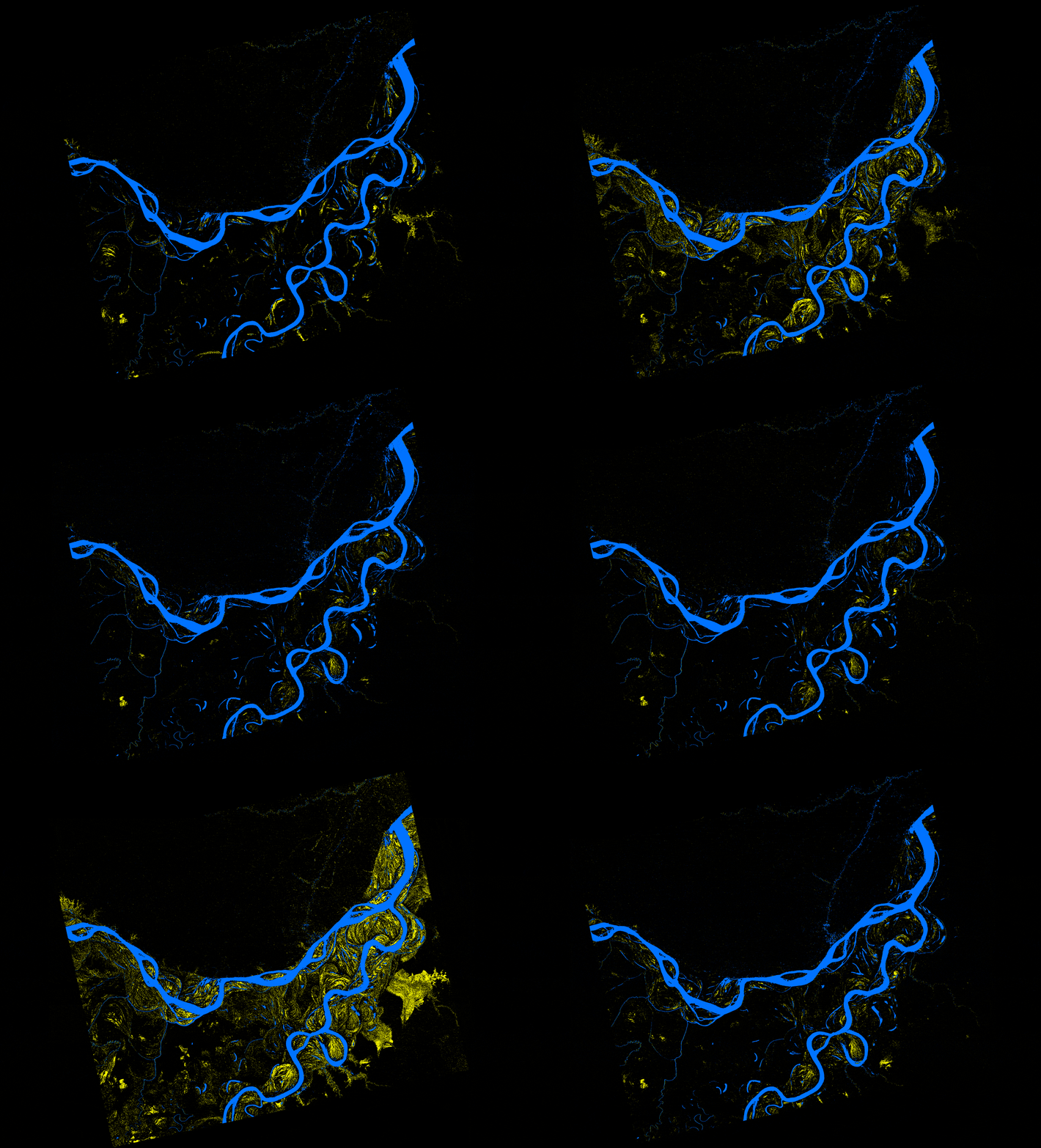
In this recipe, we describe methods used to (a) create an inundation image animation from 16 PALSAR RTC products and (b) produce an inundation map that quantifies the number of flooding events from the given set of data.

Source: Bruce Chapman, JPL, and Rick Guritz, ASF

Prerequisites

Part 1 Materials List

  • ALOS PALSAR RTC products (see sample granules below)
  • ArcMap (version 10.3 used in this recipe)
  • Adobe Photoshop (CS6 used in this recipe)

Part 2 Materials List

  • ArcMap
  • Lee-filtered db images from Part 1: Generating an Inundation Animation.

Part 1: Generating an Inundation Animation

Download and Organize Data

Download data either by clicking the links to the sample granules (below) or by bulk downloading using the Vertex data portal.

Organize data.

  • Extract data from the downloaded .zip files and copy the HH image from each granule into a single HH frame folder.

Convert Images to Decibels

Convert the RTC images from linear power to db

  1. In ArcMap, load all of the RTC HH GeoTIFF images from the folder. If prompted to create pyramids for an image layer, click No.
  2. Start the Raster Calculator tool (Spatial Analysis Tools > Map Algebra). 
    Note: Raster Calculator is part of the Spatial Analyst toolbox, which requires the Spatial Analyst license.
  3. Create output folder HH_db, and specify output filename as Rnnnnn_db.tif where nnnnn is orbit number.
  4. Compute db = 10.*Log10 (“RTC_HH_granule”)
  5. Repeat process for all RTC granules.
This image shows the Raster Calculator set-up for one sample granule.
Image Caption

Raster Calculator set-up for one sample granule.

Process and Classify Images

Filter images to reduce speckle

  1. In the ArcMap top menu, go to Windows > Image Analysis
  2. Select the first image.
  3. Under Processing, click on Add Function.
  4. In the Function Template Editor, right-click on Identity Function, mouse-over Insert Function, and select Speckle Function from the menu.
  5. In the parameters menu that appears, change the Filter Type setting from “Lee” to “Enhanced Lee” and keep the rest of the parameters set to their defaults.
  6. The files that result from this are temporary. To save them permanently to the hard drive as a GeoTIFF, use the Copy Raster (Data Management Tools > Raster > Raster Dataset) tool, with the Output Raster Dataset field set to a directory and filename (ending in .tif) of your choice, and all other fields blank.
  7. Repeat steps 2-6 for all images.
This image shows the location of the Add Function tool in the Image Analysis.
Image Caption

Location of the Add Function tool in the Image Analysis.

Require calculation of statistics

  1. In ArcMap, display all filtered db images created by the Copy Raster tool.
  2. Open Batch Calculate Statistics (Data Management Tools > Raster > Raster Properties).
  3. Drag and drop all images into the input and click OK to calculate statistics for all of the images.

Display images

  1. Right-click on a feature layer and select Properties. Then click on the Symbology tab. Under Show: select Classified. Then, under Classification, set Classes to 2.
  2. Click the Classify button and a histogram will display.
  3. By default, Classification Method is “Natural Breaks (Jenks).” Two vertical blue lines appear on the graph, and you should notice a small peak and a large peak indicating a bimodal distribution.
  4. Set Classification Method to Manual, and specify a starting breakpoint, such as “-14.” Click OK.
This image shows the final results of steps 1-5 with the suggested breaks.
Image Caption

Final results of steps 1-5 with the suggested breaks.

   5.  Under Color Ramp, double-click on the first class Color box and select a blue color.

   6.  Double-click on the second class Color box, select black and click OK. The feature layer will be displayed with open water as blue and land as black.

Notes: The values for the breakpoints can change significantly between locations and datasets, and will generally require several iterations to determine.

Refine the breakpoint value until water is mostly contained within river channels, and a very small number of blue dots show on land outside river channels
  1. Right-click the image layer and select Properties.
  2. Click on the Symbology tab; then click on Classify…
  3. Change the value of the breakpoint, increasing it by one each time (so “-13” is the first increased value).
  4. Click OK.
  5. Again specify the two colors for the two classes as blue and black; then click OK.

Notes: We found “-11” to be the best value for minimizing water speckle over land.

Further refine breakpoint values
  1. Determine a second breakpoint for areas in the image that are brighter due to double bounce of flooded forests. Here, you will determine a breakpoint on the other side of the large peak.
  2. Start with a higher value such as “0.”
  3. Set the first class color box to black and the second class color box to yellow, for values greater than the breakpoint. Look for yellow in the image and notice how much speckle noise you have away from the bright feature areas.
  4. Decrease the breakpoint value by one until the amount of speckle is close to what was observed for the blue class.
    Notes: We found “-4” to be a good value for the second class.
  5. Select the number of classes to be 3 and enter both breakpoint values. Set the first class Color to blue, second class Color to black, and third class Color to yellow. You should see the image classified with water channels as blue and double bounce areas as yellow.

Notes: We found it useful to pick a minimum flood and maximum flood image to verify that the breakpoints work as desired. Some knowledge of the extent of seasonal flooding is useful to confirm that the results are correct.

Save a colorized raster dataset for each classified image for creating an animation
  1. Use the Apply Symbology From Layer tool (Data Management Tools > Layers and Tables Views) to set the symbology of the remaining greyscale images, with the Symbology Layer field set to any correctly colored image.
  2. When each image is colored correctly, right-click on the image and select Data > Export Data… This will display the Export Raster Data window.
  3. Set Extent to Data Frame (Current).
  4. Set Output Raster to Use Renderer and Force RGB.
  5. Specify an output directory by clicking the folder button; then browse to the desired output directory.
  6. In the Name field, specify the output filename, such as “class_xxxxx_db.tif,” and Format: “TIFF.”
  7. Click the Save button.

Generate and View Animated GIF

Generate animated GIF to show the sequence of classified images showing inundation
  1. Open Adobe Photoshop.
  2. Select File > Scripts > Load Files into Stack… to load the color classified imagery.
  3. Use the Browse button to navigate to the directory you used for the “Export_Data” step in ArcMap. Select all input files. The data files will load in the layers control panel.
  4. Once the data are all loaded, click on the Create Frame Animation button in the Timeline tap section located below the image. This will create a single frame instance.
This image shows the location of the timeline menu (red arrow) and "Make Frames From Layer" (blue arrow) in Photoshop.
Image Caption

Location of the timeline menu (red arrow) and "Make Frames From Layer" (blue arrow) in Photoshop.

   5.  In the bottom right corner of the image display window, click on the menu button that looks like an arrowhead next to four horizontal lines. A timeline menu is displayed.

   6.  In the timeline menu, select Make Frames From Layers to populate the timeline with all image frames. The frames are numbered 1 through 16. There is a delay setting below each frame.

Notes: It is preferred to set the delay to increments of 0.5 seconds per cycle of PALSAR data. Each cycle is 671 orbits; if there are gaps in the temporal coverage, then a longer delay can be set as a multiple of 0.5 seconds. In our case, we set delays of 0.5, 0.5, 1.5, 1.0, 0.5, 0.5, 0.5, 1.5, 2.0, 0.5, 1.5, 1.0, 0.5, 0.5, and 0.5 respectively. The delay of 1.0 was when one cycle was skipped; 1.5 for when two cycles were skipped, etc.

   7.  Click on the “0 sec.” dropdown menu under each frame, which offers a choice of delay settings. If the specific delay you want is not listed, select Other and enter the delay.

   8.  If you want the animation to loop more than once, click on the Once button located below the timeline images and select 3 times, for example.

   9.  To save this animation, select File > Save For Web.

Notes: A warning may be displayed due to the size of the images; click yes if it does. In the image size section, type 15% to reduce the image size of the output.

   10.  Click the Save button, specify the output filename, and click save again to save the animated GIF image.

Using your file browser, navigate to the output directory containing the animated GIF. Double-click on the file to execute. Your animation should be displayed.

Sample Inundation Animation

This is a sample Inundation Animation
Caption

Sample Inundation Animation

Part 2: Generating a Colorized Inundation Map

Classify Images

Classify each image to water (1) or land (0)

  1. In ArcMap, load each of the Lee-filtered db images. Then Reclassify the floating point data of each image, mapping all water areas to 1 and all non-water areas to 0. Select the Input Raster as one of the displayed images. This will populate the reclass table. There are nine data ranges, plus NoData. First, select ranges 2 through 7, and delete them. Then change the remaining.
  2. Also, specify the output filename and check the box to set data outside data range to NoData. The result should be an image with two values: 0 and 1. 

    Notes: Values in this table can be tricky; once you have set all new values, click on an unchanged value to ensure that all values are entered.
     
  3. Repeat this for all images. Then right-click on each input image, and select remove to leave just the classified images.
i. Old Values:New Value:
ii. -29.082478 – -11.01
iii. -11.0 – -4.00
v. -4.0 – 14.3570531
v. NoData0
This image shows the how to set-up classify in ArcGIS for one sample granule.
Image Caption

Reclassify set-up in ArcGIS for one sample granule.

Create the Final Product

Add up all these images

  1. Bring up Raster Calculator and notice the list of images on the left.
  2. In the equation box, type in “count=”
  3. Double-click on the first image name; then click on the + button.
  4. Continue adding filenames with the symbol + between each until all image names are used.
  5. Specify the path and filename of the output raster you will create.
  6. Click the OK button to execute the command. 

Notes: The combined image will display with random colors assigned. It is a good idea to set the color for 0 and 1 to black. Usually, values of 1 are due to remaining speckle in the data after filtering. You can change colors by right-clicking on a color in the layers panel, which brings up a matrix of standard colors. Select colors that are easily distinguished and in some logical order.

  1. When you are satisfied with the color settings, right-click on the filename and select Data > Export Data. An export raster data panel will display.
  2. Set Data Frame (current) for Extent.
  3. Click the checkbox for Use Renderer and Force RGB.
  4. Specify an output directory, click the folder button, and browse to the output directory for this classified image.
  5. Also specify the output filename, such as “overlap_count.tif,” and Format: “TIFF.”
  6. Click the Save button.

Notes: This creates a full-resolution image of inundation. You should also use the snipping tool to grab a low-resolution version of the overlap count image and the color key to be used with either image.

Sample Colorized Map

This image shows a map of inundation in the Amazon rain forest. The color key provides the color for the number of times an area was flooded in 16 granules, and 16 (pink) represents constant river. Numbers less than 16 are the number of times an area floods. Credit: Chapman, Guritz 2016; RTC: ASF 2015; Includes Material ©JAXA/METI 2007.
Image Caption

Map of inundation in the Amazon rain forest. The color key provides the color for the number of times an area was flooded in 16 granules, and 16 (pink) represents constant river. Numbers less than 16 are the number of times an area floods. Credit: Chapman, Guritz 2016; RTC: ASF 2015; Includes Material ©JAXA/METI 2007.

Sample Granules

Click on product names to download each granule individually, or copy the list of granule names and paste them in Vertex to bulk download them. See Part 1: Generating an Inundation Animation for more detailed instructions on using Vertex.

Details

Last Updated

Published on

Data Centers

Alaska Satellite Facility DAAC (ASF DAAC)