Earthquakes and Volcanoes Data Pathfinder

Geological forces below the surface of the Earth have created some of our most inspiring landscapes, but these same forces often also threaten our way of life and devastate communities. This Data Pathfinder links to datasets and tools for use in understanding the disaster response and impact assessment of earthquake deformation and volcanic eruptions.
Image
An unexpected series of blasts from a remote volcano in the Kuril Islands sent ash and volcanic gases streaming high over the North Pacific Ocean, June 22, 2019. Credit NASA Earth Observatory

While earthquakes are only the third most common disaster, they kill the greatest number of people. Earthquakes cannot be accurately predicted, yet scientists and decision makers can still seek to understand relative fault activity, earthquake likelihood, population vulnerability, exposure, and risk to aid in response and relief.

Volcanic eruptions are less frequent and rarely kill people, as there are natural warnings leading up to eruptions allowing for the evacuation of people in threatened areas; however, volcanoes can still have tremendous impacts locally, regionally and even globally.

In addition to the datasets below, NASA has several other projects that may have earthquake- and volcano-related data or tools. View Other Resources to find out more.

Please visit the Earthdata Forum, where you can interact with other users and NASA subject matter experts on a variety of Earth science research and applications topics.

Find the Data

Datasets on population exposure, vulnerability and risk, and earthquake hazard potential.
Global Navigation Satellite System (GNSS) data for determining how stations near active faults move relative to each other.
NASA data made available immediately following an earthquake or volcanic event to help in mitigation and relief.
The dispersal of aerosols such as sulfur dioxide preceding and during an event can have not only an immediate but also a long-term effect on the atmosphere.
Nighttime lights data can be used to monitor volcanic plumes as well as assess power outages and power recovery.
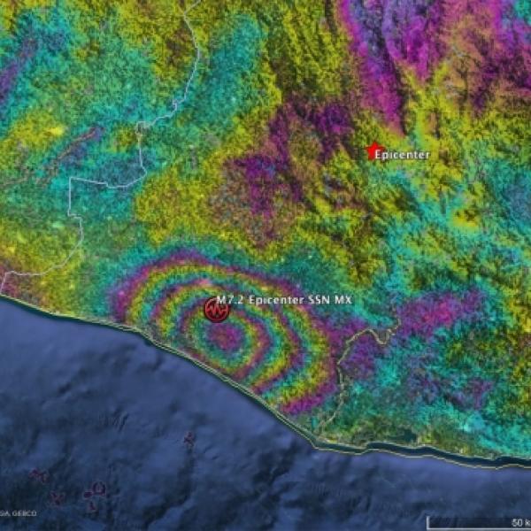
Interferometric SAR data provide centimeter-level measurements of displacement from earthquake ruptures and volcanic eruptions.
Tools for Data Access and Visualization

Earthdata Search | Panoply | Giovanni | Worldview | Sentinel Toolbox

Earthdata Search

Earthdata Search is a tool for data discovery of Earth Observation data collections from NASA's Earth Observing System Data and Information System (EOSDIS), as well as U.S and international agencies across the Earth science disciplines. Users (including those without specific knowledge of the data) can search for and read about data collections, search for data files by date and spatial area, preview browse images, and download or submit requests for data files, with customization for select data collections.

Image

In the project area, for some datasets, you can customize your granule. You can reformat the data and output as HDF, NetCDF, ASCII, KML, or GeoTIFF format. You can also choose from a variety of projection options. Lastly, you can subset the data, obtaining only the bands that are needed.

Image

Panoply

Files in HDF and NetCDF format can be viewed in Panoply, a cross-platform application that plots geo-referenced and other arrays. Panoply offers additional functionality, such as slicing and plotting arrays, combining arrays, and exporting plots and animations.

Giovanni

Giovanni is an online environment for the display and analysis of geophysical parameters. There are many options for analysis. The following are the more popular ones.

  • Time-averaged maps are a simple way to observe the variability of data values over a region of interest.
  • Map animations are a means to observe spatial patterns and detect unusual events over time.
  • Area-averaged time series are used to display the value of a data variable that has been averaged from all the data values acquired for a selected region for each time step.
  • Histogram plots are used to display the distribution of values of a data variable in a selected region and time interval.

For more detailed tutorials:

  • Giovanni How-To's on GES DISC's YouTube channel.
  • Data recipe for downloading a Giovanni map in NetCDF format and converting its data to quantifiable map data in the form of latitude-longitude-data value ASCII text.

Worldview

NASA's EOSDIS Worldview visualization application provides the capability to interactively browse over 1,000 global, full-resolution satellite imagery layers and then download the underlying data. Many of the available imagery layers are updated within three hours of observation, essentially showing the entire Earth as it looks "right now." This supports time-critical application areas such as wildfire management, air quality measurements, and flood monitoring. Imagery in Worldview is provided by NASA's Global Imagery Browse Services (GIBS). Worldview now includes nine geostationary imagery layers from GOES-East, GOES-West and Himawari-8 available at ten minute increments for the last 30 days. These layers include Red Visible, which can be used for analyzing daytime clouds, fog, insolation, and winds; Clean Infrared, which provides cloud top temperature and information about precipitation; and Air Mass RGB, which enables the visualization of the differentiation between air mass types (e.g., dry air, moist air, etc.). These full disk hemispheric views allow for almost real-time viewing of changes occurring around most of the world.

Image

Sentinel Toolbox

The European Space Agency (ESA) Sentinel-1 Mission consists of two satellites, Sentinel-1A and -1B, with synthetic aperture radar instruments operating at a C-Band frequency. They orbit 180° apart, together imaging the entire Earth every six days. SAR is an active sensor and so can penetrate cloud cover and vegetation canopy and can observe at night. It also provides useful information to detect movement of Earth material after an earthquake, volcanic eruption or landslide. SAR data are very complex to process, however, ESA has developed a Sentinel-1 Toolbox to aid with processing and analysis of Sentinel-1 data.

For more information on active sensors, see What is Remote Sensing.

SAR Interferometry

Once you have downloaded the data, a data file before the event and a data file after the event, you will need to co-register the two files and then create an interferogram. The process for doing that follows:

Image
  1. Visualize: Open the files in the Sentinel Toolbox. Important note: DO NOT unzip the downloaded SAR file. When you expand the Bands folder, you will find bands containing the real (i) and imaginary (q) parts of the complex data. In Sentinel-1 IW SLC products, you will find three sub-swaths labeled IW1, IW2, and IW3. To view the data, double-click on the Intensity_Sub-Swath_Polarization band of one of the two images.
  2. Coregister: For interferometric processing, two or more images must be coregistered into a stack. One image is selected as the master and the other images are the "slaves." The pixels in "slave" images will be moved to align with the master image to sub-pixel accuracy. To do this, select Radar/Coregistration/S-1 TOPS Coregistration. For more information on this type of processing, view Sentinel Online's Terrain Observation with Progressive Scans SAR (TOPSAR) processing technique.
    1. In the Read tab, select the first product. This should be the earlier of the two SLCs.
    2. In the Read(2) tab, select the other product. This will be your "slave" image.
    3. In the TOPSAR-Split tabs, select the appropriate sub-swath and polarization for each of the products.
    4. In the Apply-Orbit-File tabs, select the Sentinel Precise Orbit State Vectors. If precise orbits are not yet available for your product, you may select the restituted orbits, which may not be as accurate but will be better than the predicted orbits available within the product.
    5. In the Back-Geocoding tab, select the Digital Elevation Model (DEM) to use and the interpolation methods. The default is the Shuttle Range Topography Mission 3 Sec DEM.
    6. In the Write tab, set the Directory path to your working directory.
    7. Click Run to begin co-registering the data. The resulting co-registered stack product will appear in the Product Explorer window with the suffix Orb Stack.
  3. Interferogram: The interferogram is formed by cross-multiplying the master image with the complex conjugate of the "slave." The amplitude of both images is multiplied while their respective phases are differenced to form the interferogram.
    1. Select the new stack file in the product explorer and then select Radar/Interferometric/Products/Interferogram Formation.
    2. Keep the default values for Interferogram Formation, but confirm that the output Directory path is correct.
    3. Click Run.
    Through the interferometric processing flow, the tool tries to eliminate other sources of error so that what is left is typically the surface deformation related to an event. You can visualize the phase information at this step.

    Interferometric fringes represent a full 2π cycle of phase change. Fringes appear on an interferogram as cycles of colors, with each cycle representing relative range difference of half a sensor's wavelength. Relative ground movement between two points can be calculated by counting the fringes and multiplying by half of the wavelength. The closer the fringes are together, the greater the strain on the ground.

  4. Multilooking and Phase Filtering: Lastly the phase associated with topography has to be removed and additional phase filtering to reduce noise and enhance the appearance of the deformation fringes.
Image

Step-by-steps of this can be found within ASF DAAC's InSAR data recipes.

Last Updated