Overview

The software package Panoply has a line plot function that allows users to create a plot of data values along a latitude or longitude line in a data map. Using Giovanni map output, many different data variables that vary and co-vary spatially can be visualized, providing insight for many different geophysical processes. This tutorial provides a stepwise description for creating a Giovanni data map, downloading the corresponding netCDF file, opening this file with Panoply, and creating line plots.

Example

Line plots of Hurricane Milton (2024) data.

Prerequisites

If you do not have Panoply installed, first download and install the Panoply software from NASA's Goddard Institute for Space and Studies (GISS). Please note that Panoply version 5.x requires an installation of Java 11 or software that allows Java applications to run, such as Java Development Kit (JDK). Please review the README documentation provided with the Panoply software download files for additional instructions and guidance.

Also, before accessing data at NASA's Goddard Earth Sciences Data and Information Services Center (GES DISC), a user must first register with Earthdata Login, then be authorized to access data at GES DISC by following the steps outlined for data access.

Access Giovanni via a web browser.

Procedure

The following procedure describes how to:

  1. Select data and create data maps of Hurricane Milton with Giovanni.
  2. Download the data corresponding to the data maps.
  3. Open the data file with Panoply.
  4. Plot the data as a map, and then select a latitude or longitude line and create a line plot for the selected line.

1. Select Data and Create Data Maps of Hurricane Milton with Giovanni

Hurricane Milton formed in the Bay of Campeche on October 7, 2024, and intensified rapidly. It moved slowly eastward, with the eye staying just north of the northern Yucatan Peninsula as Milton achieved its maximum intensity as a Category 5 hurricane on October 8. Milton then moved to the northeast and made landfall as a Category 3 hurricane, with the eye coming ashore just south of Tampa Bay.

The Giovanni user interface allows the selection of the time range and region of interest, the data variables to be visualized, and the visualization type. For this tutorial, data variables from the Modern-Era Retrospective analysis for Research and Applications Version 2 (MERRA-2) will be used.

1. The image below shows the selections required for a two-day animation of MERRA-2 hourly Sea Level Pressure data. The frames of the animation will be used to select a timeframe for the subsequent visualizations. The second image shows the bounding box chosen for the animation.

Image
Image Caption

Make the selections shown in the image above: for "Select Plot" click on "Animation"; for the "Time Period" choose "2024 - 08 - 01" to "2024 - 10 - 31" and; for the "Region of Interest" select the area shown in the next image. For "Keyword", enter "sea level pressure".

Image
Image Caption

Select the bounding box shown above, in the "Select Region" drop-down menu (top right) by clicking on the map icon. 

2. Now that a time period and region have been selected, maps for several variables will be created for this time period. The selections are shown below. Select the variables by using the checkbox on the left. 

Note that using the faceted search categories at left makes finding data much easier; specifying “MERRA-2 Reanalysis” as the “Platform/Instrument” and “Hourly” as the “Temporal Resolution” markedly reduces the number of variables in the list. 

Image

3. Clicking the “Plot Data” button will provide all the visualizations in one step.

The image below shows the initial appearance of the first frame of the animation. 

Image

4. Use the "Options" menu, at the top right, to select a particular range of values and to select the color palette. Clicking “Re-Plot” will change the animation to the new options.

Image

5. When the modified animation is finished, the frames can be downloaded by clicking on “Download” and selecting “Video Frames.” This will create a compressed file for download, which can then be extracted to show the image of each frame.

Image

After examining these frames, the period between 17-18Z (UTC) on October 8 was selected. This frame is shown below, along with the modified color palette. For each downloaded frame, the time corresponding to the midpoint of the time period is shown, so the time shown for this frame is 1730Z.

Image

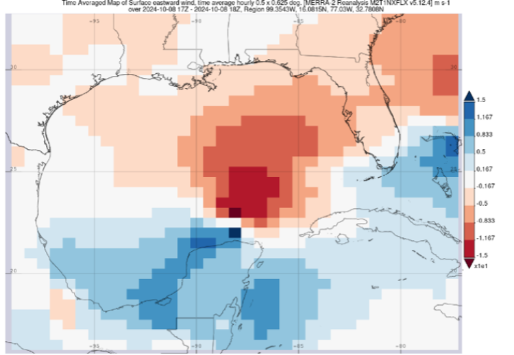
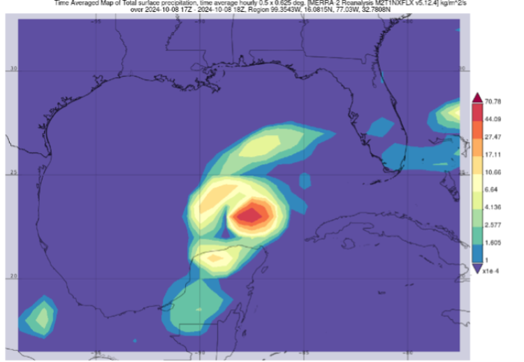
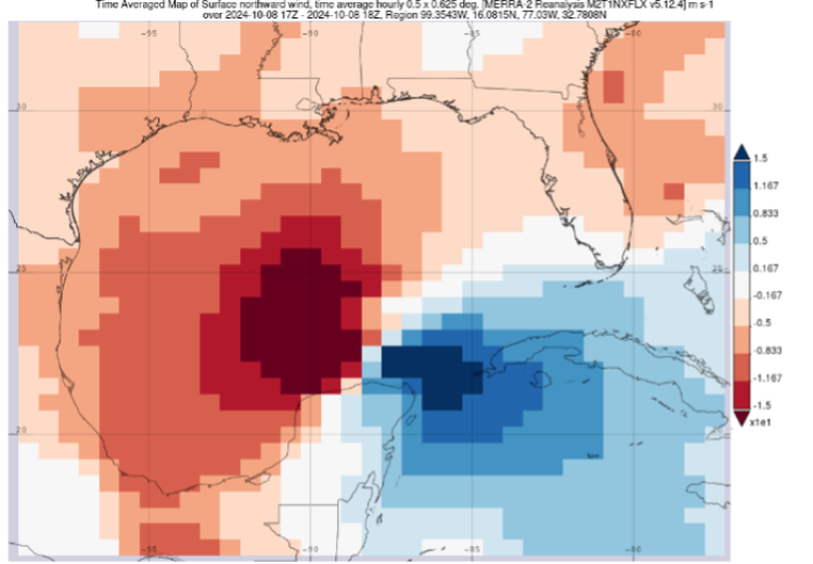
The map output for the selected variables is shown below. Different color palettes were used; the selection of colors is a user choice and does not affect the line plots. For some of the plots, including Sea Level Pressure, the Smoothing option was used along with the default palette. Smoothing in Giovanni is not a mathematical operation; it simply shapes the corners of the pixels into curves.

Image
Image Caption

Sea level pressure

Image
Image Caption

Total precipitable water vapor

Image
Image Caption

Northward wind component

Image
Image Caption

Total precipitation

Image
Image Caption

Total latent energy flux

Image
Image Caption

Eastward wind component

2. Download the Data Corresponding to the Data Maps

1. To make it easier to use the line plot option in Panoply, create sub-region maps for each of the variables. The new bounding box is shown below. The corner points, which can be put in the “Select Region” box, are -95.0,20.0,-80.0,25.0 (West Longitude, South Latitude, East Longitude, North Latitude).

The reason for this step is to reduce the number of lines of latitude in the file. After this bounding box has been created, uncheck the Eastward Wind component variable, as this variable will use a different bounding box.

Image

2.  Click “Plot Data” to create the new maps. Once this step is completed, the data can be downloaded in NetCDF format by clicking “Download” and selecting “NetCDF” for each individual map. A file will be created for download. 

It is a good idea to name each of these files for the variable to keep track of their contents. For example, the Sea Level Pressure file was named “sea level pressure cross section.”

Image

3. The bounding box for the Eastward Wind component is shown below. The corner point coordinates are -90,16,-85,30. After creating this bounding box, unselect the other variables and then re-select “Surface Eastward Wind, time average.”  Click “Plot Data” again to create this map and download the corresponding NetCDF file.

Image

3. Open the NetCDF Mapped Data File With Panoply

  • Panoply should be installed on your system. An icon for Panoply should be created, which will open the application. If not, search for Panoply on the system and then open the application.
  • Remember that Javascript or a utility that allows Java applications to run must also be installed.
  • When Panoply is open, the initial window should be similar to the image below. If it has been used before, a list of files that Panoply can open in a directory that has been accessed before may be displayed.
Image

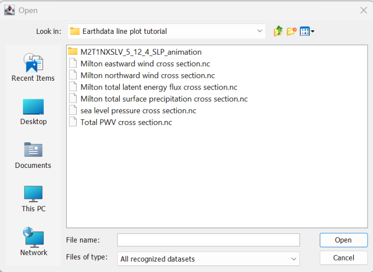
1. To open a file, click on "File", then "Open". Navigate to the directory with the downloaded NetCDF files. The available files will be shown for selection.

Image

For this example, “sea level pressure cross section.nc” is selected. This is how the screen will appear when the file has been opened.

Image

2. The bottom line is the actual data, “Sea level pressure, time average.” Click on this line, and the "Create Plot" icon color (top right) will become brighter. Click on the icon, and the plot choices are displayed, as shown below.

Image

4. Plot the Data as a Map with Panoply, then Select a Latitude or Longitude Line and Create a Line Plot for the Selected Line

1. First, a map of the data will be plotted with Panoply (to ensure the correct data are being used). Click "Create", and the map grid will be shown. 

The Plot Controls dashboard for the gridded map has nine options under “Show”, which are:

  • Arrays (default)
  • Contours
  • Grid
  • Labels
  • Layout
  • Map Projection
  • Overlays
  • Scale
  • Shading
  • Vectors

These will be accessed to modify the plot.

2. It may be necessary to navigate the grid to where the mapped data is located (this can also be set as a default option), using the Map Projection dashboard. The image below shows the mapped data, and the lat/lon coordinates for the approximate center of the map (-88.0 E, 23.5 N). The plot can be zoomed in or out by clicking on "Plot" above the map and clicking on the appropriate command. 

Note: the Scale dashboard provides numerous color palette options, and the minimum and maximum values for the Palette range can be adjusted here as well.

Image

Here’s the same plot, zoomed in. The 22.5 deg N latitude line that will be used for the line plot is shown (the grid spacing and labeling can also be changed in Panoply).

Image

3. Now the line plot can be created. Go back to the main screen, click the "Create Plot" icon again, and now choose the line plot option on the bottom. Note that “lon” (longitude) is selected for the horizontal axis, “lat” (latitude) is the default.

Image

Now click "Create", and the output should appear similar to this:

Image

In the "Plot Controls" dialog box, the “Show” menu for line plots has five options: 

  • Arrays
  • Grid
  • Labels
  • Layout
  • Stroke

The Arrays dashboard can be used to select a single line, which for the eye of Milton is the 23.5 degree latitude line, between 23.25 and 23.75 degrees latitude (the 6th line of the 11 available lines) as was done above. After selecting the line, the line plot for that line will be displayed.

The Grid dashboard is used to adjust the maximum and minimum values for the Y-axis to a maximum of 1012 hPA and minimum of 988 hPA, and the title was changed on the Labels dashboard, with the following result.

Image

Shown below are the maps and corresponding line plots for the other variables selected.

Total Precipitable Water Vapor

Image
Image

Total Surface Precipitation 

As the area of maximum total surface precipitation was offset from the center of the storm, this plot does not go through the eye of Milton. The 23.0 deg N latitude line was used, rather than 22.5 deg N.

Image
Image

Total Latent Energy Flux

Image
Image

Surface Northward Wind

Image
Image

Surface Eastward Wind

Note that the horizontal scale is latitude, from 16 deg N at left to 30 deg N at right. The dashboard has a one-click option to switch the axis endpoints, if desired.

Image
Image

Related Learning Resources

Expand your skills using the Panoply line plot data display option and Giovanni output:

Details

Last Updated

Aug. 19, 2025

Published

Aug. 19, 2025

Data Archive

Goddard Earth Sciences Data and Information Services Center (GES DISC)