Since its initial launch in December 2011, the engineers and developers supporting NASA Worldview have added a steady stream of new features and functionalities that enable users to create customized animations, search by location, measure distances and area, and compare imagery from different dates. Now, Worldview has added a new charting feature that lets users create a line chart (or graph) offering statistics (e.g., median, mean, minimum, maximum, and standard deviation) for a single variable on a single date or date range for an area of interest.
NASA Worldview Releases New Charting Tool
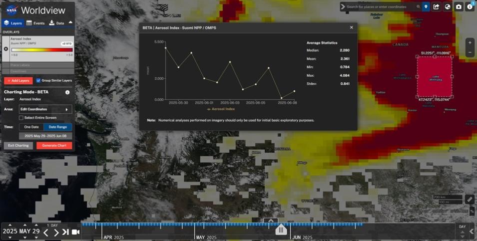
This screen capture from NASA Worldview shows a time series chart and its corresponding statistics associated with the high aerosol index values due to large wildfires in the Canadian provinces of Manitoba, Saskatchewan, and Alberta. These data were collected by the Ozone Mapping and Profiler Suite (OMPS) aboard the Suomi National Polar-orbiting Partnership (Suomi NPP) satellite. The time series chart displays Aerosol Index values covering the time period from May 29 to June 8, 2025, of the area shown within the bounding box over Lake Winnipeg. Credit: NASA Worldview
For example, the chart in the image above shows the variability in aerosol index values between the dates of May 29 and June 8, 2025. Aerosol index is a measure of the ultraviolet (UV)-absorbing particles in the air from sources such as dust storms, wildfire smoke, or industrial pollution located in the lower troposphere (1 to 3 kilometers above the surface). Aerosol index measurements range from 0 to 5, where 5 indicates heavy concentrations of aerosols that can reduce visibility and potentially impact human health.
According to the statistics in this chart, the median aerosol measurements for this 10-day period were 2.28, with a maximum of 4.08. While the chart shows a steady decline in aerosol index values due to wildfire smoke movement over the 10-day period and aerosol index measurements can vary significantly over time, these statistics provide a snapshot of the conditions, and when combined with other datasets, can be used to assess the impact of aerosol sources.
“Users have been asking us to add a charting feature to Worldview for some time, and although it’s available for only beta testing and evaluation at this time, we’re pleased to be able to provide our users with a functionality that allows them to view important statistical trends for one variable over time,” said Minnie Wong, a systems engineer for NASA Worldview with NASA's Earth Science Data and Information System (ESDIS) Project.
When the charting feature is fully complete, this feature will allow users to chart more than one variable at a time and increase the number of points being plotted.
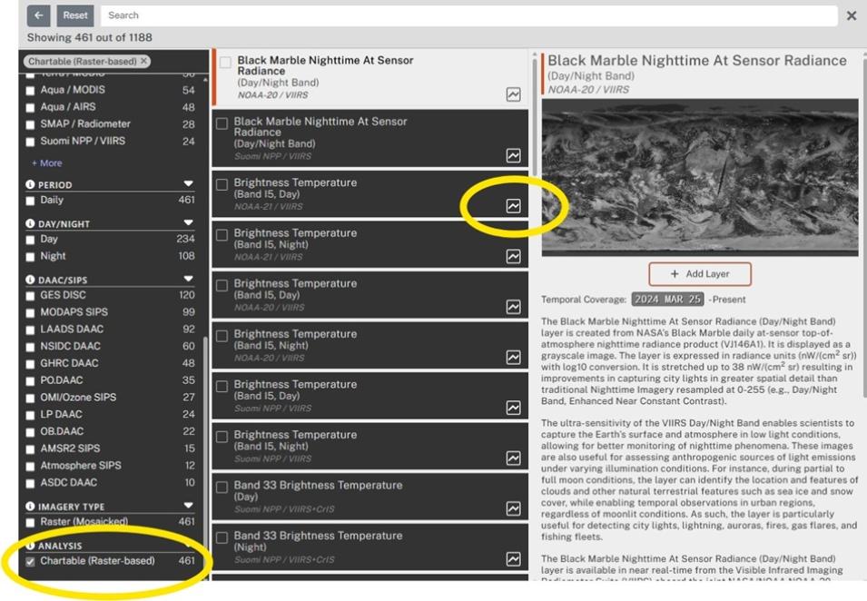
NASA Worldview allows users to interactively browse, compare, and animate more than 1,000 global, full-resolution satellite imagery layers provided through NASA's Global Imagery Browse Services (GIBS) and then download the underlying data. Many of those products are available within hours of being acquired—essentially showing the entire Earth as it looks "right now." Currently, Worldview offers 461 chartable, raster-based layers.
Because the charting feature is currently available for beta testing and evaluation, any numerical analyses performed on imagery should only be used for initial basic exploratory purposes and not for formal scientific study. This is because the imagery available in Worldview is generally of lower precision than the original data and has often had additional processing steps applied to it (e.g., projection into a different coordinate system).
Users requiring a scientifically rigorous statistical analysis should download the data and analyze it with a more robust application, such as NASA Giovanni.
Wong invites users to explore the charting tool and then offer their feedback about it with the NASA Worldview team. Users can provide their comments via the “send feedback” option in under the information icon located in the top right of the screen.
Try It Out
Follow this link to a Worldview chart showing sea surface temperature data for Lake Huron from the from the Visible Infrared Imaging Radiometer Suite (VIIRS) aboard the Suomi National Polar-orbiting Partnership (Suomi NPP) satellite. The data pertain to a 2-year period from April 12, 2023, to April 12, 2025.
Users can create their own time series chart by following these steps:
- Go to Worldview.
- Click on the red “Add Layers” button in the Worldview main menu (on the left side of the screen).
- Select the layer to be charted by clicking on the radio button to the left of the layer name and then close the layer selection window.
- On the main Worldview window, click the “Start Charting” button and then move and resize the bounding box to your area of interest. (Note: Users can also edit the bounding box coordinates in “Edit Coordinates” by checking the “Entire Screen” checkbox.)
- To select a date range, click on the dates in the “Charting Mode Date Selection” box. To select a single date, select “One Date.”
- To generate a chart of change over time, click on the red “Generate Chart” button. (As part of this beta feature release, the number of plotted data points may be reduced if it exceeds 31 points.)
- To generate statistics, click on the red “Generate Statistics” button to calculate median, mean, minimum, maximum, and standard deviation.

