Health and Air Quality Data Pathfinder - Find Data

Air pollution is one of the largest global environmental and health threats. Instruments aboard NASA satellite and airborne platforms continually acquire data about these pollutants.
Image
Image of a human hair with aerosols in PM10 and PM2.5 beside it for comparison.
A human hair is much larger than PM10 and PM2.5 aerosols. As a result, aerosols can remain suspended while they travel great distances. Their small size also enables them easily to be inhaled into the lungs. Credit: U.S. EPA.

Aerosols are minute solid particles or liquid droplets that are suspended in the atmosphere. A single aerosol particle is hard to detect by the human eye since most aerosols are 10 microns or smaller in size. A human hair, in comparison, has a diameter of between 17 and 181 microns. Aerosols are a form of particulate matter (PM); PM is classified based on the average size of the particles comprising it in microns (e.g., PM1.0, PM2.5, and PM10). PM10 is a common designation and refers to aerosols with a diameter of 10 microns or smaller, such as dust or pollen. Air-quality reports frequently identify a PM10 subgroup called PM2.5, which includes PM with diameters of 2.5 microns or smaller, such as particles formed through combustion and organic compounds.

Aerosols, or the gases that lead to their formation, come from many sources. They can come from exhaust from vehicle tailpipes and from desert sands, from sea spray and fires, volcanic eruptions and factories. Even forests, soils, or communities of ocean plankton can be aerosol sources. In addition, many aerosols are “secondary pollutants,” meaning they are formed in the atmosphere through chemical reactions of other pollutants and chemicals or are formed when individual molecules start to clump together. When there are high concentrations of aerosols, we say that the air is polluted. Because of their minute size, aerosols easily are transported long distances by global air currents. To learn more about aerosols, see the Earth Observing article Aerosols: Tiny Particles, Big Impact.

Image
Table with air quality index with colors ranging from green (good air quality) to brown (poor air quality)
The Air Quality Index is a tool developed by the EPA to communicate, report, and forecast air quality information. Click on image for larger view. Credit: EPA.

People and animals can easily inhale aerosols. While larger particles (such as sea salt) tend to fall rapidly from the air, smaller particles (such as PM10 and PM2.5) can remain suspended and be transported long distances. More importantly, their small size enables them to be inhaled easily and lodge in the lungs and bloodstream, fueling a variety of cardiovascular and respiratory diseases. For a given aerosol type, those in the PM2.5 size group are more harmful than larger size groups. Air quality reports often represent aerosol concentrations as the number of particles by mass per unit volume of air (usually in units of micrograms per cubic meter).

Image
World map with areas of low AOD indicated in darker shades of red.
Global average monthly AOD for March 2022. Pale yellow areas (such as over Australia) indicate regions with low aerosol concentrations and high visibility; reddish brown areas (such as over Africa) indicate regions with high concentrations of aerosols and low visibility. Gray indicates areas with no data. Credit: NASA Earth Observatory.

Aerosols scatter and absorb incoming sunlight, which reduces visibility. The degree of absorption and scattering depends upon the particle’s composition. The measurement of the level to which aerosols prevent light from traveling through the atmosphere is called Aerosol Optical Depth (AOD). AOD is a measure of the quantity of light that small particles remove by absorption and scattering within a column.

From an observer on the ground, an AOD of less than 0.1 is characteristic of a clear sky and maximum visibility. As AOD increases to 0.5, 1.0, and greater than 3.0, aerosols become so dense that the Sun is obscured. For more information on this process, check out the NASA Earth Observatory article Aerosols and Incoming Sunlight.

AOD Use Cases on YouTube:

Image
Screenshot showing 2 world maps displaying burning fires and a second map showing average monthly aerosol amounts.
Locations of burning fires (top image) compared to average monthly aerosol optical depth (bottom image). Credit: NASA Earth Observatory.

AOD is a column-integrated value of aerosols in the atmosphere obtained by measuring the scattering and absorption of solar energy from the top of the atmosphere to the surface. The non-aerosol signal of surface reflectance needs to be separated from the aerosol signal to accurately obtain an AOD. This is challenging because the satellite instrument cannot penetrate cloud cover and highly reflective surfaces, such as ice or snow, producing misrepresentations of the data. To account for this, scientists have developed two algorithms for Moderate Resolution Imaging Spectroradiometer (MODIS) data to help with these effects: Dark Target and Deep Blue. In the latest dataset collection, these two algorithms have been merged, using the highest quality for each. While it does provide the easiest use of global coverage, there are some risks (see the websites above for more information).

The Visible Infrared Imaging Radiometer Suite (VIIRS) aboard the joint NASA/NOAA Suomi National Polar-orbiting Partnership (Suomi NPP) satellite collects AOD data at a finer spatial resolution than MODIS. VIIRS uses the Deep Blue algorithm over land and the Satellite Ocean Aerosol Retrieval (SOAR) algorithm over water to determine atmospheric aerosol loading for daytime cloud-free, snow-free scenes. With all of the VIIRS data, downloading a file will provide the data with just the land algorithm, just the ocean algorithm, and the merged algorithm. As with all remote sensing data, make sure you are choosing the best product for your area.

Research quality data products can be accessed using Earthdata Search (Note: An Earthdata Login is required to download data):

Data are in HDF or NetCDF format, and can be opened using the NASA Panoply data viewer.

Data products can be visualized as a time-averaged map, an animation, seasonal maps, scatter plots, or a time series through an online interactive tool called Giovanni (Note: An Earthdata Login is required for full Giovanni functionality):

  • OMI AOD
    The Ozone Monitoring Instrument (OMI) aboard NASA's Aura satellite has a coarser spatial resolution than MODIS and VIIRS, but provides data at individual wavelengths from the ultraviolet (UV) to the visible. Within Giovanni, you can plot daily data at these individual wavelengths. This is important because pollutants have different spectral signatures. For example, a wavelength range around 400 nm can be used to detect elevated layers of absorbing aerosols such as biomass burning and desert dust plumes. The two AOD products provided through Giovanni use two different algorithms—OMI Multi-wavelength (OMAERO) and OMI UV (OMAERUV). OMI Multi-wavelength (OMAERO) is based on the multi-wavelength algorithm and uses up to 20 wavelength bands between 331 nm and 500 nm. This algorithm uses reflectances for a wide variety of microphysical aerosol models representative of desert dust, biomass burning, volcanic, and weakly absorbing aerosol types. OMI UV (OMAERUV) uses the near-UV algorithm, which is capable of retrieving aerosol properties over a wider variety of land surfaces than is possible using measurements only in the visible or near-IR, because the reflectance of all terrestrial surfaces (not covered with snow) is small in the UV.
  • MODIS AOD

Follow these steps to plot data in Giovanni: 1) Select a map plot type; for more information on choosing a type of plot, see the Giovanni User Manual. 2) Select a date range. Data are in multiple temporal resolutions, so be sure to note the start and end date to ensure you access the desired dataset. 3) Check the box of the variable in the left column that you'd like to include and then plot the data.

Near real-time (NRT) data can be accessed using NASA Worldview:

  • MODIS Aqua/Terra Combined Algorithm AOD
    The merged Dark Target/Deep Blue AOD layer provides a more global, synoptic view of AOD over land and ocean.
  • VIIRS Level 2 Deep Blue Aerosol Product
    The product uses the Deep Blue algorithm over land and the SOAR algorithm over water to determine atmospheric aerosol loading. The product is designed to facilitate continuity in the aerosol record. Deep Blue uses measurements from multiple Earth observing satellites to determine the concentration of atmospheric aerosols along with the properties of these aerosols.
  • OMI AOD Multi-wavelength and UV
    The multi-wavelength layer and the UV absorbing layer displays the degree to which airborne particles (aerosols) prevent the transmission of light through the process of absorption (attenuation), and the UV extinction layer indicates the level at which particles in the air (aerosols) prevent light (extinction of light) from traveling through the atmosphere. Toggling between these three can provide more distinction on the types of aerosols present.

NASA's Applied Remote Sensing Training (ARSET) program has a Jupyter Notebook that accesses VIIRS AOD data and converts AOD to PM2.5 available through the ARSET GitHub site. For more information on using this notebook, view the MODIS to VIIRS Transition for Air Quality Applications and other Health and Air Quality Trainings.

Image
Global map with aerosol sources in various colors
A NASA model called the Goddard Earth Observing System Forward Processing (GEOS FP) offers an expansive view of the mishmash of particles dancing and swirling through the atmosphere on August 23, 2018. Colors indicate specific aerosols (e.g., red = agricultural burning; pink = dust). Click on image for larger view. Credit: NASA Earth Observatory image by Joshua Stevens, using GEOS data from the Global Modeling and Assimilation Office at NASA's Goddard Space Flight Center.

Aerosol Index (AI) is a measurement related to AOD and indicates the presence of an increased amount of aerosols in the atmosphere. The main aerosol types that cause signals detected in this value are desert dust, significant fire events, biomass burning, and volcanic ash plumes. In general, the lower the AI, the more clear the sky.

Research quality data products can be accessed using Earthdata Search (Note: An Earthdata Login is required to download data):

  • OMI AI
    OMI provides an Ultraviolet Aerosol Index. When opening the data in Panoply, select "UVAerosolIndex".
  • TROPOMI AI data
    ESA TROPOMI AI provides additional information on this level 2 data product.

Data are in HDF5 or NetCDF format and be opened using the NASA Panoply data viewer.

Data products can be visualized as a time-averaged map, an animation, seasonal maps, scatter plots, or a time series through an online interactive tool called Giovanni (Note: An Earthdata Login is required for full Giovanni functionality):

Follow these steps to plot data in Giovanni: 1) Select a map plot type; for more information on choosing a type of plot, see the Giovanni User Manual. 2) Select a date range. Data are in multiple temporal resolutions, so be sure to note the start and end date to ensure you access the desired dataset. 3) Check the box of the variable in the left column that you'd like to include and then plot the data.

Near real-time (NRT) data can be accessed using NASA Worldview:

  • OMI AI
  • OMPS AI
    OMPS Aerosol Index layer indicates the presence of ultraviolet (UV)-absorbing particles in the air.

AOD is the quantity of light removed from a beam by scattering or absorbing during its path through a medium and is a unitless measure. PM2.5, on the other hand, is a measure of the mass of particles in a specific size range within a given volume of air near the surface. It's important to note the differences between AOD and PM2.5:

  • AOD is an optical measurement; PM2.5 a mass concentration measurement
  • AOD is an integrated column measurement from the top of the atmosphere to the surface; PM2.5 a ground measurement
  • AOD is an area-averaged measurement; PM2.5 a point measurement
Image
Aerosol optical depth can be used as a source of particulate matter with a diameter of less than 2.5 micrometers through various mathematical methods. Moving from a two-variable method to a multi-variable method increases in complexity, thereby increasing the difficulty level.
Aerosol optical depth can be used as a source of particulate matter with a diameter of less than 2.5 micrometers through various mathematical methods. Moving from a two-variable method to a multi-variable method increases in complexity, thereby increasing the difficulty level. Click on image for larger view. Source: ARSET.

Because the two measurements are so different, it may seem that there is no correlation. However, they do correlate, and there are several different techniques to convert from AOD to PM2.5. It is important to note that while there is a relationship between AOD and PM2.5, there are other factors that can affect AOD, like humidity, the vertical distribution of aerosols, and the shape of the particles. For example, an increase in humidity will increase the size of particles and therefore increase the AOD even though the PM2.5 level will be the same.

The different techniques are a two-variable method, a multivariate method using neural networks, and combining satellite data, in-situ data, and models. The latter approach is the most difficult but generally preferred. NASA's Applied Remote Sensing Training Program (ARSET) has a Jupyter Notebook that accesses VIIRS AOD data and converts AOD to PM2.5 that is available through the ARSET GitHub site. For more information on using this notebook, view the MODIS to VIIRS Transition for Air Quality Applications. For more information on satellite-derived PM2.5, view Satellite Derived Annual PM2.5 Datasets in Support of United Nations Sustainable Development Goals and other Health and Air Quality Trainings.

Ground-based AOD measurements are available online through the Aerosol Robotic Network (AERONET). The Environmental Protection Agency’s ground-based PM and Ozone combined Air Quality Index (AQI) can be accessed at AirNow. AirNow International is an international program for AQI, with information provided from partnering organizations.

For trends in PM2.5, there are several resources that utilize both ground-based and remote sensing data:

Nitrogen, oxygen, and argon make up more than 99% of Earth’s atmosphere. Other gases, such as nitrogen dioxide, sulfur dioxide, carbon monoxide, ozone, carbon dioxide, water vapor, methane, and ammonia, are considered trace gases. Although relatively unimportant in terms of their absolute volume, trace gases have significant impacts on Earth’s weather and climate. Trace gases also are constituents of harmful pollutants. The following tabs describe some of these key trace gas pollutants in more detail.

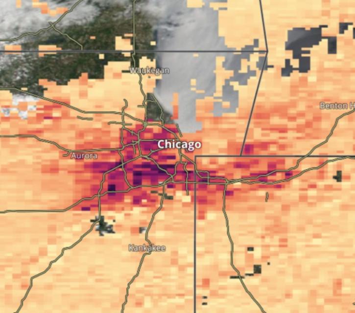
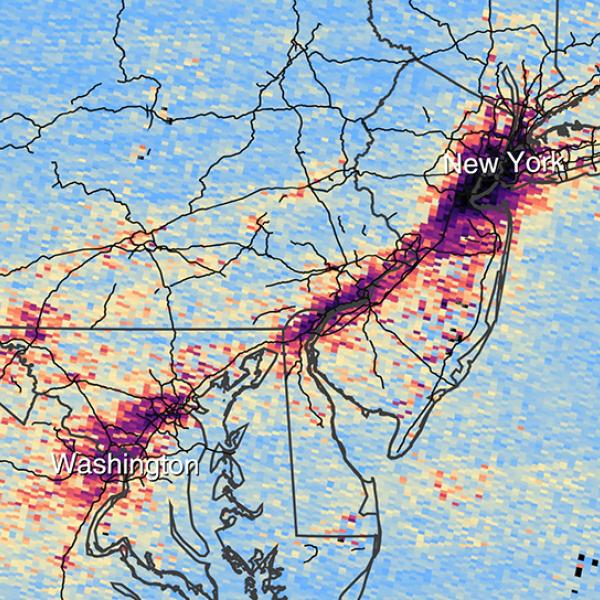
Nitrogen dioxide (NO2) is a pollutant, the primary sources being automobile exhaust, industry, and the burning of fossil fuels. Once in the air, it can aggravate respiratory conditions such as asthma. Long-term exposure can lead to the development of asthma and potentially increase susceptibility to respiratory infections. NO2 reacts with other chemicals in the atmosphere, forming particulate matter and ozone, producing haze and even acid rain, and contributing to nitrogen pollution in coastal waters. NASA's Air Quality site provides more information on NO2, as well as trend maps and pre-made images of NO2 over cities and power plants. For more information, please see the NASA ARSET YouTube video How NASA Measures Nitrogen Dioxide (NO2), Part 1/2.

Research quality data products can be accessed using Earthdata Search (Note: An Earthdata Login is required to download data):

  • OMI NO2 data
    The OMI sensor provides daily gridded and non-gridded products at 13x24 km resolution; data are in HDF5 format and can be opened using the NASA Panoply data viewer. A tutorial on using OMI NO2 data is available as a PDF and a webinar on Analyzing NO2 data within Java and Excel is available from the Earthdata YouTube channel.
  • TROPOMI NO2 data
    Image
    TROPOspheric Monitoring Instrument tropospheric vertical column of nitrogen dioxide data opened in NASA tool, Panoply
    TROPOMI tropospheric vertical column of nitrogen dioxide data opened using NASA's Panoply data viewer. The red circle indicates a change needed in the scaling factor due to the very small numbers. Credit: NASA.
    The TROPOspheric Monitoring Instrument (TROPOMI) aboard Sentinel 5, is an ESA (European Space Agency) mission. ESA's TROPOMI NO2 provides additional information on this Level 2 data product. It is important to note that, because of the very small numbers in tropospheric vertical column of NO2, you will need to change the scaling factor in Panoply (see image from June 2018 to right). Data are in NetCDF format, and can be opened using Panoply.

Data products can be visualized as a time-averaged map, an animation, seasonal maps, scatter plots, or a time series through an online interactive tool called Giovanni (Note: An Earthdata Login is required for full Giovanni functionality):

Follow these steps to plot data in Giovanni: 1) Select a map plot type; for more information on choosing a type of plot, see the Giovanni User Manual. 2) Select a date range. Data are in multiple temporal resolutions, so be sure to note the start and end date to ensure you access the desired dataset. 3) Check the box of the variable in the left column that you'd like to include and then plot the data.

Near real-time (NRT) data can be accessed using NASA Worldview:

NASA also has a global nitrogen dioxide monitoring site that provides imagery of daily NO2 from OMI.

Image
Nishinoshima Volcano, off the coast of Japan, emits a plume of sulfur dioxide as it erupts, July 3, 2020. Data are from the Sentinel 5P TROPOspheric Monitoring Instrument (TROPOMI).
Nishinoshima Volcano, off the coast of Japan, emits a plume of sulfur dioxide as it erupts, August 3, 2020 (dark area on right side of image). Data are from the Sentinel-5P TROPOspheric Monitoring Instrument (TROPOMI). Credit: NASA.

Sulfur dioxide (SO2) is a pollutant of great concern; the primary sources are the burning of fossil fuels by power plants and industry. Volcanic emissions also contribute SO2, but in relatively smaller quantities. As with NO2, SO2 can aggravate respiratory conditions, especially asthma. In areas with high levels of SO2, sulfur oxides can react with other components to create small particles that contribute to overall particulate matter. This small particulate matter can be ingested and can contribute to low visibility in areas where SO2 is high. SO2 can also lead to acid rain.

Research quality data products can be accessed using Earthdata Search (Note: An Earthdata Login is required to download data):

  • OMI SO2 data
    OMI provides daily total column data at a resolution of 13x24 km; data are in HDF5 format.
  • OMPS SO2 data
    SO2 Total and Tropospheric Column data from the Ozone Mapping and Profiling Suite (OMPS) Nadir-Mapper (NM) sensor aboard the Suomi NPP satellite; data are in HDF5 format. Note that the data are at various atmospheric levels (planetary boundary layer, stratospheric layer, and tropospheric layers).
  • TROPOMI SO2 data
    ESA TROPOMI SO2 provides additional information about this Level 2 data product.

Data can be opened using the NASA Panoply data viewer.

Data products can be visualized as a time-averaged map, an animation, seasonal maps, scatter plots, or a time series through an online interactive tool called Giovanni (Note: An Earthdata Login is required for full Giovanni functionality):

Follow these steps to plot data in Giovanni: 1) Select a map plot type; for more information on choosing a type of plot, see the Giovanni User Manual. 2) Select a date range. Data are in multiple temporal resolutions, so be sure to note the start and end date to ensure you access the desired dataset. 3) Check the box of the variable in the left column that you'd like to include and then plot the data.

NRT data can be accessed using NASA Worldview:

NASA has a global sulfur dioxide monitoring site that provides imagery of daily SO2 from OMI, OMPS, and TROPOMI. The site also provides information on the source of emissions. In addition, the Historical Anthropogenic Sulfur Dioxide Emissions dataset, available through NASA's Socioeconomic Data and Applications Center (SEDAC), offers annual estimates of anthropogenic global and regional SO2 emissions spanning the period 1850-2005.

Video file
The streak of red, orange, and yellow across South America, Africa, and the Atlantic Ocean in this animation points to high levels of carbon monoxide, as measured by the AIRS instrument aboard NASA's Aqua satellite. The carbon monoxide primarily comes from fires burning in the Amazon basin, with some additional contribution from fires in southern Africa. The animation shows carbon monoxide transport sweeping east throughout August, September, and October 2005. Credit: NASA/Goddard Space Flight Center Scientific Visualization Studio.

Carbon monoxide (CO) is a harmful pollutant that is released when something is burned, such as in the combustion of fossil fuels or biomass. Outdoor levels are rarely high enough to cause issues; when they do reach dangerous levels, however, they can be of concern to people with certain types of heart disease.

Research quality data products can be accessed using Earthdata Search (Note: An Earthdata Login is required to download data):

  • AIRS CO data
    The Atmospheric Infrared Sounder (AIRS) measures abundances of trace components in the atmosphere, including CO. Data are available daily (AIRS3STD), over 8 days (AIRS3ST8), or monthly (AIRS3STM). The instrument measures the amount of CO in the total vertical column profile of the atmosphere (from Earth’s surface to top-of-atmosphere).
  • MOPITT CO data
    The Measurements of Pollution in the Troposphere (MOPITT) instrument measures the amount of CO present in the total vertical column of the lower atmosphere (troposphere) and is measured in mole per square centimeter (mol/cm2). Data are available daily or monthly. Data are acquired using the thermal and near-infrared channels.
  • TROPOMI CO data
    ESA TROPOMI CO provides additional information on this Level 2 data product.

Data can be opened and viewed using the NASA Panoply data viewer.

Data products can be visualized as a time-averaged map, an animation, seasonal maps, scatter plots, or a time series through an online interactive tool called Giovanni (Note: An Earthdata Login is required for full Giovanni functionality):

Follow these steps to plot data in Giovanni: 1) Select a map plot type; for more information on choosing a type of plot, see the Giovanni User Manual. 2) Select a date range. Data are in multiple temporal resolutions, so be sure to note the start and end date to ensure you access the desired dataset. 3) Check the box of the variable in the left column that you'd like to include and then plot the data.

Near real-time (NRT) data can be accessed using NASA Worldview:

  • AIRS CO data
    AIRS Level 2 data are nominally 45 km/pixel at the equator but the data in Worldview have been resampled into a 32 km/pixel visualization. The data are in units of parts per billion by volume at the 500 hPa pressure level, approximately 5,500 meters (18,000 feet) above sea level.
  • MOPITT CO data
Image
Ozone can be either good or bad, depending on where it is found in the atmosphere. In the stratosphere, ozone protects humans, plants, and animals from harmful UV radiation. In the troposphere or closer to the ground level, however, ozone serves as a potent greenhouse gas and can aggravate existing health problems in humans.
Ozone is found throughout Earth’s atmosphere, although it is concentrated about 15 miles above Earth’s surface in the Ozone Layer. This layer filters harmful UV light (UV-B and UV-C) and protects life on Earth. Surface-level Ozone forms from combustion and is often associated with smog. Credit: NASA Aura.

Ozone (O3) is a trace gas that can be either beneficial or harmful depending on where it is found in the atmosphere. Beneficial O3 is found naturally in trace amounts in the upper atmosphere (the stratosphere), where it protects life on Earth from the Sun’s ultraviolet (UV) radiation. Harmful O3 is found in the troposphere or closer to ground level, where it serves as a potent greenhouse gas and can aggravate existing health problems in humans, especially those with respiratory conditions. O3 is not emitted directly into the atmosphere, but instead forms from the chemical reaction between nitrogen oxides and volatile organic compounds that are emitted from power plants, industrial facilities, and cars powered by internal combustion engines. Reactions to create O3 take place in the presence of sunlight. Because of the need for sunlight, unhealthy levels of O3 are often reached on very sunny days and in urban environments.

Research quality data products can be accessed using Earthdata Search (Note: An Earthdata Login is required to download data):

  • OMI O3 data
    OMI provides daily total column data; data are in HDF5 format.
  • AIRS O3 data
    AIRS measures abundances of trace components in the atmosphere including ozone. Data are available daily (AIRS3STD), over 8 days (AIRS3ST8), or monthly (AIRS3STM). The instrument measures the amount of O3 in the total vertical column profile of the atmosphere (from Earth’s surface to top-of-atmosphere). Data are in HDF format.
  • TROPOMI O3 data
    ESA TROPOMI O3 provides additional information on this level 2 data product. Data are in NetCDF format.

Data and be opened and viewed using the NASA Panoply data viewer.

Data products can be visualized as a time-averaged map, an animation, seasonal maps, scatter plots, or a time series through an online interactive tool called Giovanni (Note: An Earthdata Login is required for full Giovanni functionality).

Follow these steps to plot data in Giovanni: 1) Select a map plot type; for more information on choosing a type of plot, see the Giovanni User Manual. 2) Select a date range. Data are in multiple temporal resolutions, so be sure to note the start and end date to ensure you access the desired dataset. 3) Check the box of the variable in the left column that you'd like to include and then plot the data.

Near real-time (NRT) data can be accessed using NASA Worldview:

  • OMI O3 data
    Visualization of the amount of ozone in the total column measured in Dobson Units (DU).

Trends on a national and regional level are available through the Environmental Protection Agency (EPA) Air Quality Trends website.

Image
Image of dust blowing off the coast of Africa.
This Terra/MODIS Worldview image was acquired June 27, 2022, and shows dust blowing off the west coast of Africa over the Atlantic Ocean. Interactively explore this image in Worldview. Credit: NASA Worldview.

Very large dust storms lasting hours or days can easily be observed and tracked using satellite imagery. The most common source of dust globally is the Sahara Desert. Giant dust storms periodically sweep off the coast of West Africa and can be transported as far as Florida and the Caribbean. The Earthdata YouTube video A Clearer View of the Haze—Using NASA GES DISC Data Tools to Examine the June 2020 Sahara Dust Event describes how dust from the West Coast of Africa was tracked to the Caribbean using tools available through NASA’s Goddard Earth Sciences Data and Information Services Center (GES DISC).

The amount of dust transported by these storms can be quantified with the Dust Score, which is calculated from data acquired by the Atmospheric Infrared Sounder (AIRS) instrument aboard NASA’s Aqua satellite. The AIRS Dust Score indicates the level of atmospheric aerosols in Earth’s atmosphere over the ocean. Dust is probable when the score is above 380, and higher scores indicate more certainty that dust is present. The AIRS Dust Score can be visualized using NASA Worldview:

  • AIRS Dust Score
    Measurement from the AIRS Infrared quality assurance subset; the imagery resolution is 2 km.
Image
The Moderate Resolution Imaging Spectroradiometer (MODIS) on NASA’s Aqua satellite acquired this natural-color image of large clouds of smoke spreading over Sakha on August 8, 2021. Plumes of this size and opacity have been common for weeks, leading to poor air quality for many of the 280,000 people who live in the nearby city of Yakutsk. Credit: NASA Earth Observatory.
The Moderate Resolution Imaging Spectroradiometer (MODIS) on NASA’s Aqua satellite acquired this natural-color image of large clouds (white areas on left side of image) and smoke (white lines extending from definite points on the ground) spreading over the Republic of Sakha in Russia on August 8, 2021. Credit: NASA Earth Observatory.

Surface reflectance is the amount of light reflected by Earth’s surface. Light colored surfaces, such as ground covered with fresh snow, reflect a high amount of light striking them and appear bright in satellite imagery. Dark or rough surfaces, such as dense forests or dark volcanic rock, reflect far less light and appear darker in imagery.

Surface reflectance data are useful when comparing multiple images for the same region to detect and characterize changes to Earth’s surface. As pollutants or aerosols like dust spread over an area, they can change the surface reflectance, and this can be detected by sensors aboard orbiting satellites. More detailed information is available through the NASA Land, Atmosphere Near real-time Capability for EOS (LANCE) Air Quality page.

In comparison with the MODIS Corrected Reflectance product, the MODIS Land Atmospherically Corrected Surface Reflectance product (MOD09) is a more complete atmospheric correction algorithm that includes aerosol correction and is designed to derive land surface properties.

Research quality data products can be accessed using Earthdata Search (Note: An Earthdata Login is required to download data):

All of the above data products are in HDF format and can be opened using NASA's Panoply data viewer. The data are also customizable to GeoTIFF.

Higher resolution surface reflectance imagery is available through the Landsat 7 Enhanced Thematic Mapper (ETM+) sensor and the Landsat 8 Operational Land Imager (OLI) instrument. Both acquire data at 30 m spatial resolution in visible and near-infrared (VNIR) every 16 days (or less as you move away from the equator). The OLI-2 aboard Landsat 9 acquires images with 15 m spatial resolution for the panchromatic band and 30 m spatial resolution for the multispectral bands. 

Landsat data can be discovered using Earthdata Search, however, you will need a USGS Earth Explorer login to download data:

Note: Landsat 9 OLI-2 data are not yet available in Earthdata Search.

Another high resolution option is imagery from the Harmonized Landsat and Sentinel-2 (HLS) project, which provides consistent surface reflectance and top of atmosphere brightness data from the OLI/OLI-2 aboard the joint NASA/USGS Landsat 8 and Landsat 9 satellites and the Multi-Spectral Instrument (MSI) aboard Europe’s Copernicus Sentinel-2A and Sentinel-2B satellites. The combined measurement enables global land observations every 2–3 days at 30 m spatial resolution.

Near real-time (NRT) data can be accessed using NASA Worldview:

  • MODIS Land Surface Reflectance Data
    These images are called true-color or natural color because this combination of wavelengths is similar to what the human eye would see. The images are natural-looking images of land surface, oceanic, and atmospheric features. Some band combinations “highlight” certain types of features better than others.
  • HLS Surface Reflectance
Image
map of world with colors indicating high PM2.5 concentrations
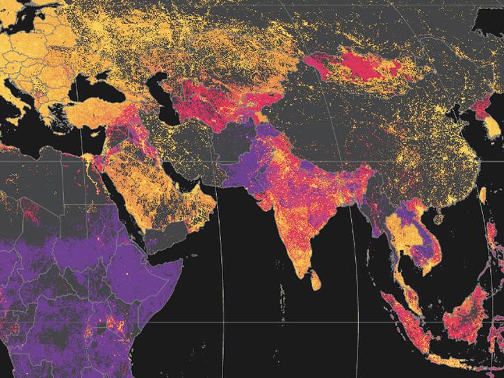
Map of global PM2.5 concentrations with orange and red colors indicating higher concentrations. Map from the SEDAC Global (GL) Annual PM2.5 Grids from MODIS, MISR, and SeaWiFS Aerosol Optical Depth (AOD), v4.03 (1998–2019) dataset. doi:10.7927/fx80-4n39. Click on image for larger view. Credit: NASA SEDAC.

Air quality-related deaths and diseases that are exacerbated by air pollution are preventable, but prevention requires a knowledge of where vulnerable populations exist and what interventions are needed in these communities. Poor air quality tends to be elevated in low to middle-income countries, where 98% of urban centers with populations greater than 100,000 do not meet World Health Organization (WHO) guidelines.

Integrating socioeconomic data with air quality data can provide a more accurate analysis of populations facing greater exposure and vulnerability from pollutants. A number of socioeconomic factors need to be considered when analyzing air quality, including:

  • Population
  • Poverty
  • Unemployment
  • Academic attainment
  • Housing burden
  • Social vulnerability

NASA’s Socioeconomic Data and Applications Center (SEDAC) is the home for socioeconomic data in NASA’s Earth Observing System Data and Information System (EOSDIS) collection. Hosted at Columbia University’s Center for International Earth Science Information Network (CIESIN), SEDAC synthesizes Earth science and socioeconomic data and information in ways useful to a wide range of decision makers and other applied users and serves as an “Information Gateway” between the socioeconomic and Earth science data and information domains.

SEDAC’s Air Quality Data for Health-Related Applications data collection provides air quality data for health-related research and applications. This collection consists of the Daily and Annual PM2.5 Concentrations for the Contiguous United States, 1-km Grids, v1 (2000–2016) and Daily 8-Hour Maximum and Annual O3 Concentrations for the Contiguous United States, 1-km Grids, v1 (2000–2016) datasets. A similar NO2 dataset is in development. Additional SEDAC datasets on population exposure and vulnerability (Note: An Earthdata Login is required for data access):

Combining regional or community-level socioeconomic data (such as life expectancy, prevalence of asthma, or prevalence of health insurance coverage) with Earth science data (such as NO2 and SO2 concentrations) provides a way of examining environmental justice aspects of air quality and exploring how certain communities are impacted to a greater degree by pollution. For more information about how NASA is applying Earth science data to environmental justice, please see the Environmental Justice at NASA Backgrounder. The following open access articles provide additional information about research using Earth science data to explore environmental justice:

  • Estimating Intra-Urban Inequities in PM2.5-Attributable Health Impacts: A Case Study for Washington, D.C. (doi:10.1029/2021GH000431)
  • Estimating Daily PM2.5 Concentrations in New York City at the Neighborhood-Scale: Implications for Integrating Non-Regulatory Measurements (doi:10.1016/j.scitotenv.2019.134094)
  • Air Quality and Environmental Injustice in India: Connecting Particulate Pollution to Social Disadvantages (doi:10.3390/ijerph18010304)
  • Developing an Adaptive Pathway to Mitigate Air Pollution Risk for Vulnerable Groups in South Korea (doi:10.3390/su12051790)
Image
Global map with countries in shades of red indicating air pollution deaths
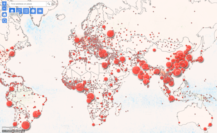
WHO global map showing deaths attributable to ambient air pollution for 2016. Darker colors indicate a higher number of deaths. Click on image for larger view. Explore this image at the WHO Map Gallery. Credit: WHO.

Air pollution is a serious health issue all over the world. According to the World Health Organization (WHO), millions of deaths every year result from exposure to outdoor air pollution. In addition, WHO data show that almost all of the global population (99%) breathe air that exceeds WHO guideline limits and contains high levels of pollutants, with low- and middle-income countries suffering from the highest exposures. Breathing air pollution, especially particulate matter, increases the risk of numerous illnesses, including pulmonary disease, respiratory infections, and lung cancer, and can lead to heart disease, heart attacks, and strokes. Toxicology, medicine, and epidemiology provide evidence that air pollution is impacting health across the globe. Unfortunately, evaluating toxicology and medicine does not provide a quantifiable measure of how and how much. Epidemiology, however, does, by providing a mechanism to evaluate the statistical relationships between air pollution and health due to variations in space and time

There are numerous health sites that provide information regarding public health as it relates to air pollution:

NASA's Applied Remote Sensing Training Program (ARSET) has resources that provide an overview of environmental parameters available from NASA Earth science for monitoring and predicting health and tools available for evaluating the relationship between environmental conditions and health outcomes:

Last Updated
Jul 20, 2022